Example Accessibility Audit according to WCAG 2.2 A and AA
Information about the article

Author: Dmitry Dugarev
In this article, I systematically reviewed the website portfolio.barrierenlos.com/audit-demo against the WCAG 2.2 A and AA criteria [1]. The review took place on April 6, 2025. This involved using both automated tools (Simulated testing with WAVE Browser Extension, manual code inspection) and manual tests with a screen reader and keyboard navigation.
The report is structured like WCAG 2.2 [1], with an evaluation for each criterion. For every unmet WCAG 2.2 criterion (A and AA), detailed explanations with code examples were created, and corresponding to-dos were derived. At the end of the report, there is an overview of all to-dos compiled during the audit. Meeting these to-dos will ensure an accessible website and EAA compliance [2].
The results and recommendations are presented in detail below.
Is Your Website Perceivable for All Users?
Perceivability is the first of the four foundational principles of web accessibility [3].
It lays the groundwork for ensuring that all users, regardless of their sensory abilities, have access to your content.
Whether someone has a visual impairment, is hard of hearing, or uses special technology to operate the internet—by adhering to the following guidelines, you ensure that no one is excluded.
Provide Text Alternatives for Everything that is Not Text.
Not Met: Non-text Content – WCAG 2.2, 1.1.1. (A)
- Have you provided a brief text alternative for all simple non-text content that fulfills the same purpose and conveys the same information?
- Have you provided a detailed text description for complex non-text content such as diagrams or infographics? (No such content present)
- Have you added a clear and unambiguous text description for all controls and input fields that explains their function? (Will be covered under 3.3.2 and 4.1.2, where it fails)
- Have you provided a suitable brief text description for time-based media or content? (No relevant time-based media present)
- Have you provided a text description for CAPTCHAs and offered an alternative method? (No CAPTCHA present)
- Have you implemented or marked non-text content so that it is ignored by assistive technology if it does not provide relevant information?
Numerous images on the website are missing alternative texts. This affects images in almost all sections: slider, features, alternating sections.
Example from the slider:
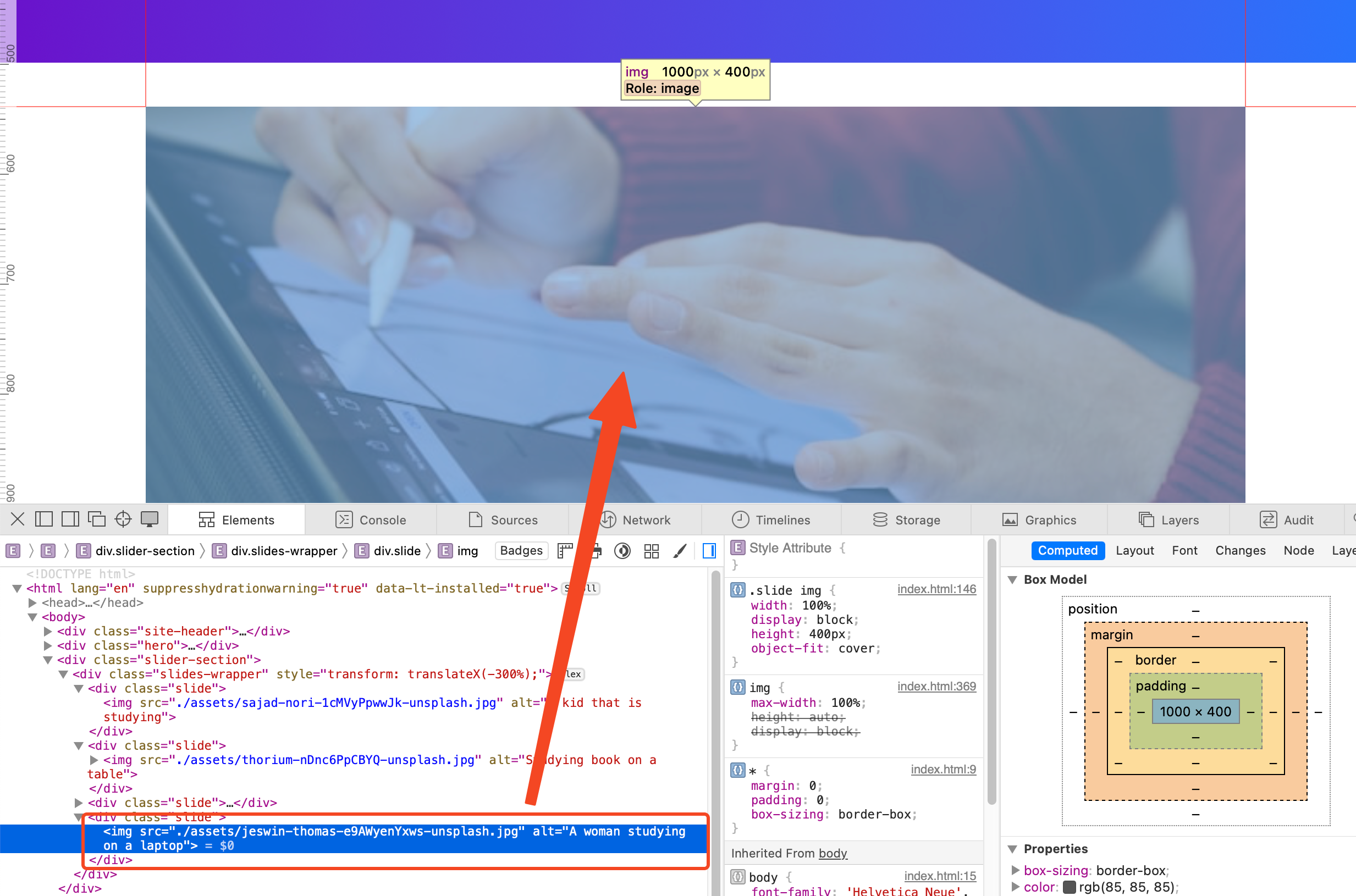
Important information is lost for screen reader users, or the context is unclear. Every image that conveys relevant information (is not purely decorative) requires a descriptive alt text [4], [5]. Purely decorative images should have an empty alt="" attribute so that they are skipped by screen readers [6], [7].
<img src="bild-2.jpg" alt="" width="..." height="..." />
However, all images on this demo page are likely purely decorative and do not require a description. They do not contribute to the content and would likely overwhelm the user with extra content.
To-Dos:
- Clear alternative texts for all images.
- Check whether individual images are actually purely decorative and explicitly mark them with
alt="".
Provide Alternatives for Time-based Media.
No time-based media (audio or video) is integrated into this website. Therefore, all requirements in this section are met.
Met: Audio-only and Video-only (Prerecorded) – WCAG 2.2, 1.2.1 (A)
- Have you provided an equivalent text alternative for all prerecorded audio content?
- Have you provided an equivalent text alternative or an audio track for all prerecorded video content without sound?
Met: Captions (Prerecorded) – WCAG 2.2, 1.2.2 (A)
- Do you offer captions for prerecorded audio content in synchronized media?
Met: Audio Description or Media Alternative (Prerecorded) – WCAG 2.2, 1.2.3 (A)
- Have you provided either an audio description or a text alternative for prerecorded video content?
Met: Captions (Live) – WCAG 2.2, 1.2.4 (AA)
- Do you offer captions for live audio content in synchronized media?
Met: Audio Description (Prerecorded) – WCAG 2.2, 1.2.5 (AA)
- Have you added an audio description for prerecorded videos in synchronized media?
Create Flexible Content Without Information Loss.
Your website should be designed to adapt to user needs. This concerns not only the presentation on different devices but also operation with various input methods.
Not Met: Information and Relationships – WCAG 2.2, 1.3.1 (A)
- Are information and relationships made programmatically determinable using semantic structure?
- If the technology used does not support semantic structure, do you offer text alternatives or additional explanations? (HTML supports semantics; it is just not used)
The website's semantic HTML structure is fundamentally flawed. It almost exclusively uses generic <div> and <span> elements instead of semantically correct HTML tags that make the structure and meaning of content understandable for assistive technologies (like screen readers) and browsers [8]. This leads to significant barriers.
Page Structure and Landmarks
Page areas like the header, navigation, main content, individual sections, and the footer are not marked with the intended HTML5 elements (<header>, <nav>, <main>, <section>, <footer>) [9], [10]. These elements define "Landmark Regions" that allow users of assistive technologies to quickly navigate between important areas of the page.
This is optional, but you can explicitly link the section to this title via aria-labelledby [11] by inputting the id of the title element there. This marks the area as a "Landmark" for users, and they could quickly access it, for example, via the screen reader's Rotor menu, or navigate quickly from one to the next.
If this is not possible, just ensure that the sections are marked with <h1...6> [12]. Users can then quickly orient themselves on the page by having all headings displayed in the Rotor menu.
- Code of the problematic area
- Code as it should be
<body>
  <div class="site-header"></div>
  <div class="hero">...</div>
  <div class="slider-section">...</div>
  <div class="section">...</div>
  <div class="section-alt">...</div>
  <div class="site-footer">...</div>
</body>
<body>
  <a href="#main-content" class="skip-link">Skip to Content</a>
  <header class="site-header"></header>

  <main id="main-content">
    <div class="hero">
      <h1 id="hero-title">...</h1>
      ...
    </div>

    <section class="slider-section" aria-labelledby="slider-title">
      <h2 id="slider-title">Current Highlights.</h2>
      ...
    </section>

    <section class="features-section" aria-labelledby="features-title">
      <h2 id="features-title">...</h2>
      ...
    </section>

    <section class="alternating-section-1" aria-labelledby="alt1-title">
      <h2 id="alt1-title">...</h2>
      ...
    </section>
  </main>
  <footer class="site-footer"></footer>
</body>
It is important to mention that the first section is not marked as such because the title in this section labels the entire page.
To-Dos:
- Mark page structure with correct HTML5 Landmark elements:
<header>,<nav>,<main>,<section>,<footer>. - Give the
<main>element an ID (id="main-content") as the target for the Skip Link. - Use
<section>elements to group thematically related content blocks and name them with headings andaria-labelledby.
Headings
Headings are represented by visually styled <div> elements (.hero-title, .section-title, .feature-title, .layout-title) instead of genuine heading tags (<h1> - <h6>) [12]. This results in the loss of the document's hierarchical structure, which is essential for screen reader users for navigation and understanding page organization [8], [13].
- Code of the problematic area
- Code as it should be
<div class="hero-title">Unlock Your Potential...</div>
<div class="section-title">Why Choose CoursePro?</div>
<div class="feature-item">
  <div class="feature-title">Expert Instructors</div>
  ...
</div>
<h1 class="hero-title">Unlock Your Potential...</h1>

<h2 class="section-title">Why Choose CoursePro?</h2>

<div class="feature-item">
  <h3 class="feature-title">Expert Instructors</h3>
  ...
</div>
To-Dos:
- Replace all visual headings with correct HTML heading tags (
<h1>to<h6>). - Ensure that the heading hierarchy is logically correct (only one
<h1>per page, no skipping levels).
Lists for Groups
Groups of related elements, such as navigation items, features in the grid, steps in the "How it Works" section, or FAQ entries, are not marked as semantic lists (<ul>, <ol>, <li>). Instead, <div> containers are often used. As a result, assistive technologies do not recognize that this is a group of related items or how many items are in the group [14].
- Code of the problematic area
- Code as it should be
- Code of the problematic area (Features Grid)
- Code as it should be (Features Grid - Basic structure):
<div class="main-nav">
  <div>Features</div>
  <div>Pricing</div>
  <div>Testimonials</div>
</div>
<nav aria-label="Main navigation">
  <ul class="main-nav">
    <li><a href="#features">Features</a></li>
    <li><a href="#pricing">Pricing</a></li>
    <li><a href="#testimonials">Testimonials</a></li>
  </ul>
</nav>
<div class="features-grid">
  <div class="feature-item">...</div>
  <div class="feature-item">...</div>
  <div class="feature-item">...</div>
</div>
<ul class="features-grid">
  <li class="feature-item">...</li>
  <li class="feature-item">...</li>
  <li class="feature-item">...</li>
</ul>
To-Dos:
- Structure navigation menus as unordered lists (
<ul>) with list items (<li>) containing links (<a>). - Mark feature grids, testimonial lists, FAQ lists, etc., as
<ul>with<li>elements (see also point 4). - Mark step-by-step instructions ("How it Works") as ordered lists (
<ol>) with<li>elements (see also point 4).
Cards and Articles (<article>)
Content blocks designed like cards (e.g., individual features, "How it Works" steps, testimonials) often represent self-contained units of information. These should not only be grouped in a list (<ul>/<ol> -> <li>) but the content of each individual card should also be marked with the <article> element.
This would give screen reader users the necessary context by, for example, directly informing them that the list contains two elements.
It is evident there that users are immediately informed that it is a list with four elements (cards). When users select a single element, they are told where that element is in the list and how many elements there are in total.
The <article> element represents a complete or self-contained composition in a document that is intrinsically distributable or reusable (e.g., a forum post, a blog entry, a product on a shop page, or a feature description).
- Code of the problematic area (Features Grid, continued)
- Code as it should be (Features Grid - Basic structure)
cards"
<div class="features-grid">
  <div class="feature-item">
    <div class="feature-title">Expert Instructors</div>
    <div>Learn from the best...</div>
    <img src="..." />
  </div>
</div>
<ul class="features-grid">
  <li class="feature-item">
    <article aria-labelledby="feature1-title">
      <img
        src="https://source.unsplash.com/random/100x100/?lightbulb,idea"
        alt="Light bulb as a symbol of expert knowledge"
      />
      <h3 id="feature1-title" class="feature-title">
        Expert Instructors
      </h3>
      <div>
        Learn from the best in the industry. Our instructors are vetted
        professionals.
      </div>
    </article>
  </li>
  <li class="feature-item">
    <article aria-labelledby="feature2-title">
      <img
        src="https://source.unsplash.com/random/100x100/?books,laptop"
        alt="Books and laptop as a symbol of flexible learning"
      />
      <h3 id="feature2-title" class="feature-title">
        Flexible Learning
      </h3>
      <div>
        Access courses anytime, anywhere, on any device. Learn at your own
        pace.
      </div>
    </article>
  </li>
</ul>
To-Dos:
- Structure sections with card layouts (Features, "How it Works," possibly Testimonials) as lists (
<ul>or<ol>). - Enclose each individual card (e.g.,
.feature-item,.step-item) in an<li>element. - Wrap the entire content within each card with an
<article>element. - Ensure that each
<article>contains a suitable heading (e.g.,<h3>,<h4>).
Interactive Elements (FAQ)
Interactive elements that trigger actions, such as expanding FAQ answers, are implemented as non-interactive <div> elements. These are not keyboard-focusable or activatable by default and lack a suitable semantic role (like "Button") or state information (like "expanded"/"collapsed") [15].
- Code of the problematic area
- Code as it should be
<div class="faq-item">
  <div class="faq-question">What payment methods...?</div>
  <div class="faq-answer" style="display: none;">
    ...
  </div>
</div>
<ul class="faq-list">
  <li class="faq-item">
    <h3>
      <button
        class="faq-question"
        aria-expanded="false"
        aria-controls="faq1-answer"
        id="faq1-question"
      >
        What payment methods do you accept?
      </button>
    </h3>
    <div
      id="faq1-answer"
      class="faq-answer"
      role="region"
      aria-labelledby="faq1-question"
      hidden
    >
      We accept all major credit cards and PayPal.
    </div>
  </li>
  <li class="faq-item">
    <h3>
      <button
        class="faq-question"
        aria-expanded="false"
        aria-controls="faq2-answer"
        id="faq2-question"
      >
        Can I get a refund if I'm not satisfied?
      </button>
    </h3>
    <div
      id="faq2-answer"
      class="faq-answer"
      role="region"
      aria-labelledby="faq2-question"
      hidden
    >
      Yes, we offer a 30-day money-back guarantee...
    </div>
  </li>
</ul>
To-Dos:
- Implement FAQ questions as native
<button>elements, ideally within a suitable heading (h3,h4...). - Structure the entire FAQ section as a list (
<ul>/<li>). - Add the necessary ARIA attributes (
aria-expanded,aria-controls) for the FAQ accordion and manage their state correctly via JavaScript. - Give the answer containers a suitable role (
role="region") and a link to the question (aria-labelledbywith the button's ID) and hide them by default (e.g., with thehiddenattribute).
Form Relationships (Labels)
The input fields (<input>, <textarea>) in the contact form lack associated <label> elements. As a result, the relationship between the visible label (which is only in the placeholder) and the input field is not programmatically determined [16]. Screen readers cannot name the field correctly. (Detailed correction covered in SC 3.3.2 Labels or Instructions).
- Code of the problematic area
- Code as it should be
<form class="contact-form">
  <input type="text" placeholder="Your Name" />
  <input type="email" placeholder="Your Email Address" />
  <textarea placeholder="Your Message"></textarea>
  <button type="submit">Send Message</button>
</form>
<form class="contact-form">
  <label for="contact-name">Your Name</label>
  <input
    type="text"
    id="contact-name"
    name="contact-name"
    placeholder="Your Name"
    autocomplete="name"
  />

  <label for="contact-email">Your Email Address</label>
  <input
    type="email"
    id="contact-email"
    name="contact-email"
    placeholder="Your Email Address"
    autocomplete="email"
  />

  <label for="contact-message">Your Message</label>
  <textarea
    id="contact-message"
    name="contact-message"
    placeholder="Your Message"
    autocomplete="off"
  ></textarea>

  <button type="submit">Send Message</button>
</form>
To-Dos:
- Add explicit
<label>elements and correctly link them to the input fields viafor/id. - Provide
<input>elements with theautocompleteattribute to enable automatic form filling.
Met: Meaningful Sequence – WCAG 2.2, 1.3.2 (A)
- Is the order of content programmatically determinable and maintained meaningfully? (The DOM order seems to match the visual order)[17]
Met: Sensory Characteristics – WCAG 2.2, 1.3.3 (A)
- Do you not rely solely on sensory characteristics (color, shape, size, etc.) for instructions? [18]
Met: Orientation – WCAG 2.2, 1.3.4 (AA)
- Can the page be used in both portrait and landscape orientation without loss of functionality or content? (No restrictions found) [19]
Not Met: Identify Input Purpose – WCAG 2.2, 1.3.5 (AA)
- Are all fields requesting user data (name, address, email, etc.) programmatically marked as such (e.g., Autocomplete)?
The input fields in the contact form (Name, Email, Message) do not have autocomplete attributes. This makes it difficult for users who rely on browser autofill functions or assistive technologies to fill out the form efficiently [20].
- Code of the problematic area
- Code as it should be
<input type="email" placeholder="Your Email Address" />
  <label for="email">Your Email Address</label>
  <input
    type="email"
    id="email"
    name="email"
    placeholder="Your Email Address"
    autocomplete="email"
  />

  <label for="name">Your Name</label>
  <input
    type="text"
    id="name"
    name="name"
    placeholder="Your Name"
    autocomplete="name"
  />
To-Dos:
- Add appropriate
autocompleteattributes for the Name (autocomplete="name") and Email (autocomplete="email") fields in the contact form.
Make Content Clear and Easily Recognizable.
The readability and recognizability of content are crucial for accessibility. Ensure that texts are easy to read, colors have sufficient contrast, and font sizes are large enough. Operating elements should also be clearly recognizable and distinguishable from each other. It is particularly important that colors do not serve as the sole source of information, as they may not be perceivable to many users.
Met: Use of Color – WCAG 2.2, 1.4.1 (A)
- Do you not rely solely on color to convey information (e.g., states)? [21]
- If color is used in images, have you integrated alternative representations (e.g., patterns, labels)?
Met: Audio Control – WCAG 2.2, 1.4.2 (A)
- Do audio contents not play automatically for longer than 3 seconds, or do you offer a stop/pause button? (No audio content present) [22]
Not Met: Contrast (Minimum) – WCAG 2.2, 1.4.3 (AA)
- Does larger text (e.g., 18 pt or 14 pt bold) have a contrast of at least 3:1? Does normally sized text (below 18 pt and below 14 pt bold) have a contrast of at least 4.5:1?
Several text elements on the page do not meet the minimum contrast requirements according to WCAG AA [23], [24]:
-
Placeholder text in forms: The placeholder text (
#999) on a white background (#ffffff) has a contrast ratio of only 2.85:1. This is too low; 4.5:1 is required.
-
Button Text:
- Green button (
#28a745BG,#fffText): Contrast 3.98:1 (too low for normal text; 4.5:1 is required).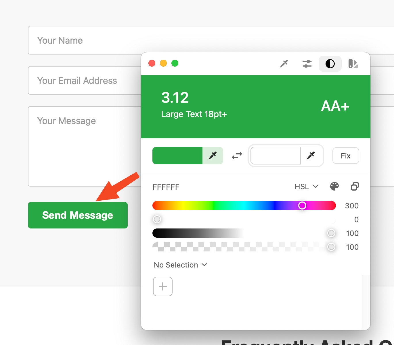
- Green button (
To-Dos:
- Darken the color of the placeholder text or ensure that fields always have a visible
<label>. - Adjust the background or text colors of the buttons (green) so that the contrast is at least 4.5:1 (since the text is normal size).
Met: Text Resizing – WCAG 2.2, 1.4.4 (AA)
- Can your text be resized up to 200% without content loss or becoming unusable? (Standard browser zoom works) [25]
Met: Images of Text – WCAG 2.2, 1.4.5 (AA)
- Do you avoid images of text if the same effect can be achieved with real text?
Not Met: Reflow – WCAG 2.2, 1.4.10 (AA)
- Does all content remain usable without horizontal scrolling and without loss of information up to a width of 320 CSS pixels?
Unfortunately, there is horizontal scrolling:
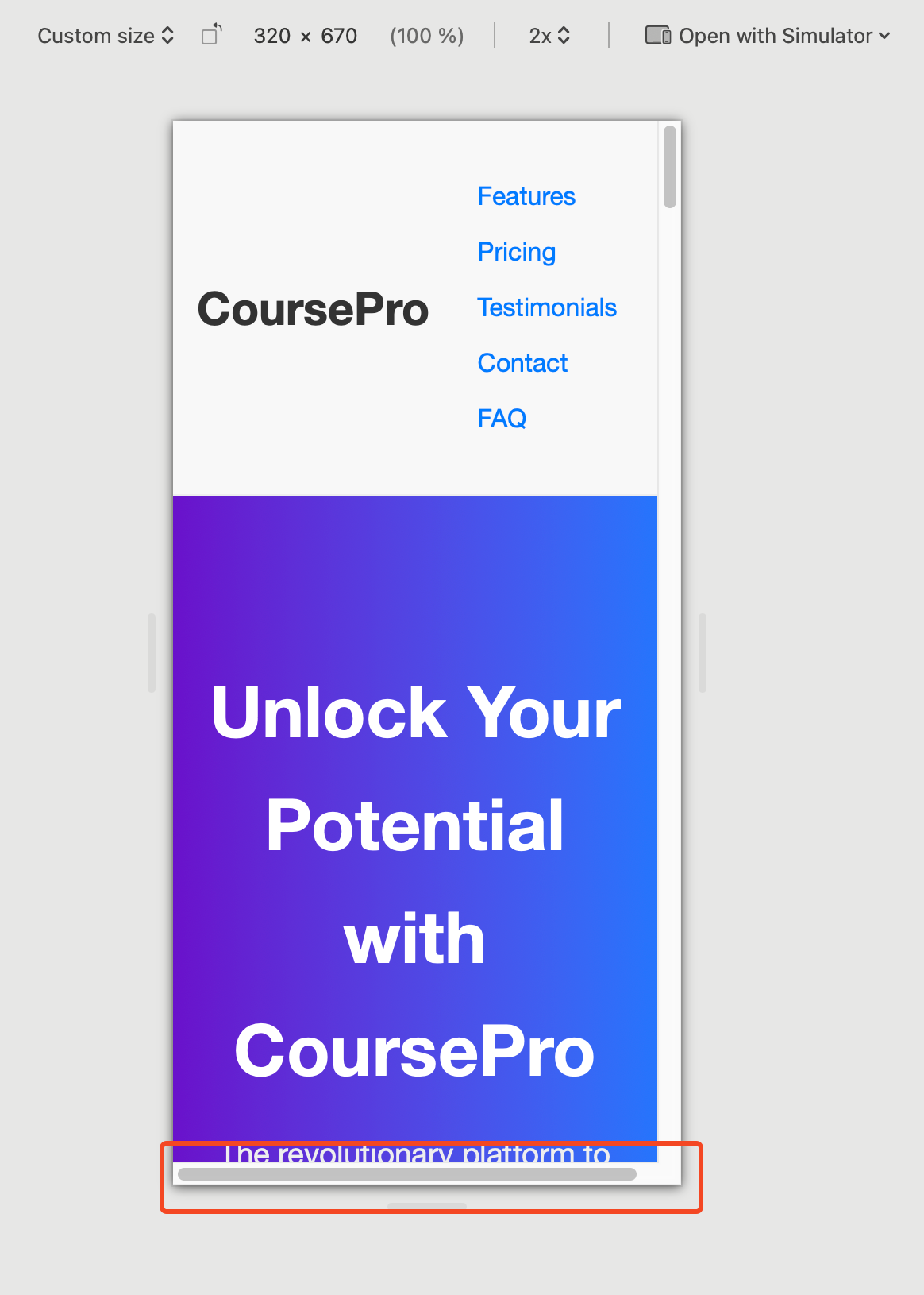
This happens because the containers in the sections with an image on the left have margin: 0 auto; and width: 90% simultaneously. One of these properties must be removed on mobile [26], [27].
To-Dos:
- Remove
width: 90%ormargin: 0 auto;from the.containerclass on mobile.
Not Met: Non-text Contrast – WCAG 2.2, 1.4.11 (AA)
- Do user interface components (buttons, focus outlines, etc.) have a contrast of at least 3:1 against the background?
- Do graphics contain important areas that show a contrast of at least 3:1? (No complex graphics whose understanding depends on contrast)
Several user interface components on the page do not meet the non-text contrast requirements according to WCAG AA [28], [29]:
-
Form field borders: The borders of the input fields (
#ccc) on a white background (#ffffff) have a contrast ratio of only 1.61:1. This is too low for the component to be recognizable.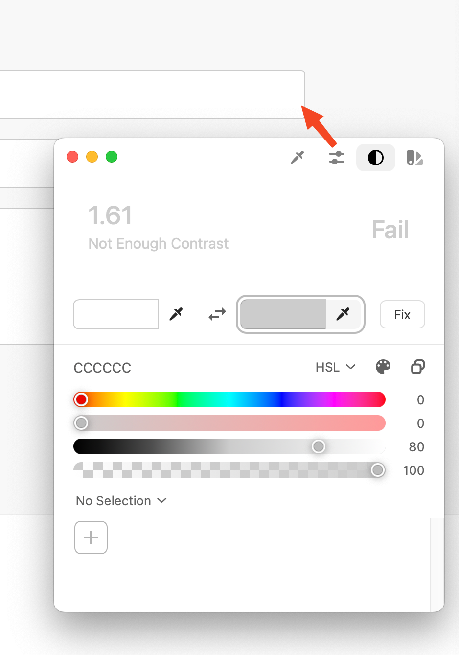
-
Focus indicators: There are no visible focus indicators for interactive elements ( see 2.4.7). Thus, the necessary contrast for the focus indicator itself is also missing.
To-Dos:
- Darken the color of the input field borders to achieve a contrast of at least 3:1 (e.g.,
#767676). - Implement visible focus indicators with sufficient contrast (see 2.4.7).
Met: Text Spacing – WCAG 2.2, 1.4.12 (AA)
- Does your page remain fully usable when line and paragraph spacing, word spacing, and character spacing are increased? (No techniques found that prevent this) [30]
Met: Content on Hover or Focus – WCAG 2.2, 1.4.13 (AA)
- Does additionally displayed content (e.g., tooltips) remain visible until you close it or remove the focus? (No such content present)
Is Your Website Operable for All Users?
The second cornerstone of accessibility is operability [3].
This aspect ensures that all users—regardless of their physical abilities or the technology they use—can navigate your website without problems and utilize all functions.
Make All Functions Accessible via Keyboard.
Not Met: Keyboard – WCAG 2.2, 2.1.1 (A)
- Is all functionality of your webpage operable via the keyboard, without specific time limits?
Several central functions and interactive elements of the website are not operable via the keyboard [31]. This excludes users who cannot use a mouse or rely on keyboard navigation (e.g., users with motor impairments or screen reader users).
Navigation Not Keyboard Operable
The main navigation elements are implemented as <div> elements. <div> elements are not interactive by default and do not receive keyboard focus. They cannot be reached with the Tab key and cannot be activated with Enter or the Space bar [31].
Only native interactive elements like links (<a> with href) and buttons (<button>, <input type="button">, etc.) or elements with explicit tabindex="0" [32] are keyboard-focusable and operable by default. Using <div>s for navigation prevents this.
- Code of the problematic area:
- Code as it should be:
<div class="site-header">
  <div class="container nav-container">
    <div class="logo">CoursePro</div>
    <div class="main-nav">
      <div>Features</div>
      <div>Pricing</div>
      <div>Testimonials</div>
      <div>Contact</div>
      <div>FAQ</div>
    </div>
  </div>
</div>
  <header class="site-header">
    <div class="container nav-container">
      <div class="logo">CoursePro</div>
      <nav aria-label="Main navigation">
        <ul class="main-nav">
          <li><a href="#features">Features</a></li>
          <li><a href="#pricing">Pricing</a></li>
          <li><a href="#testimonials">Testimonials</a></li>
          <li><a href="#contact">Contact</a></li>
          <li><a href="#faq">FAQ</a></li>
        </ul>
      </nav>
    </div>
  </header>
To-Dos:
- Replace the
<div>elements of the navigation with real<a>elements with meaningfulhrefattributes. - Structure the navigation semantically correctly as a list (
<ul>/<li>) within a<nav>element [14], [33].
FAQ Not Keyboard Operable
The questions in the FAQ section, which are used to expand/collapse the answers, are also implemented as <div> elements (<div class="faq-question">). As with the navigation, these are not keyboard-focusable or activatable [31].
For such an expand/collapse function (accordion), a <button> element is the semantically correct and accessible choice [15]. Buttons are keyboard-focusable and can be triggered with Enter/Space bar to start the associated action (here: expanding/collapsing the content via JavaScript).
- Code of the problematic area:
- Code as it should be:
<div class="faq-item">
  <div class="faq-question">What payment methods do you accept?</div>
  <div class="faq-answer" style="display: none;">
    ...
  </div>
</div>
<ul class="faq-list">
  <li class="faq-item">
    <h3>
      <button
        class="faq-question"
        aria-expanded="false"
        aria-controls="faq1-answer"
        id="faq1-question"
      >
        What payment methods do you accept?
      </button>
    </h3>
    <div
      id="faq1-answer"
      class="faq-answer"
      role="region"
      aria-labelledby="faq1-question"
      hidden
    >
      We accept all major credit cards and PayPal.
    </div>
  </li>
</ul>
To-Dos:
- Replace the
<div>elements for FAQ questions (.faq-question) with<button>elements. - Ensure that these buttons correctly control the state (
aria-expanded) and visibility of the answers (hiddenattribute) via JavaScript [15].
No Keyboard Control for Slider/Marquee
The automatically running image slider and the text marquee offer no controls whatsoever. Consequently, there are no keyboard-operable controls to manage this dynamic content (e.g., to stop, pause, or manually browse) [31], [34].
Any functionality triggered via mouse or automatically must also have equivalent keyboard operation. For sliders and marquees, this generally means buttons to pause/start the animation and potentially for manual navigation. These buttons must be implemented as <button> to ensure keyboard operability.
- Code of the problematic area
- Code as it should be
<div class="slider-section">
<div class="slides-wrapper">...</div>
</div>

<div class="marquee-section">
<div class="marquee-content">...</div>
</div>
<section
class="slider-section"
aria-roledescription="carousel"
aria-labelledby="slider-title"
>
<h2 id="slider-title" class="visually-hidden">Current Highlights</h2>
<div class="slider-controls">
<button class="slider-control pause" aria-label="Pause animation">
  Pause
</button>
<button class="slider-control prev" aria-label="Previous slide">‹</button>
<button class="slider-control next" aria-label="Next slide">›</button>
</div>
<div class="slides-wrapper" aria-live="off">...</div>
</section>

<section class="marquee-section" aria-labelledby="marquee-title">
<h2 id="marquee-title" class="visually-hidden">Marquee</h2>
<button class="marquee-control pause" aria-label="Pause marquee">
Pause
</button>
<div class="marquee-content-wrapper" style="overflow:hidden;">
<div class="marquee-content">...</div>
</div>
</section>
To-Dos:
- Add explicit controls (at least Play/Pause) for the slider and the marquee. Implement these as
<button>elements. - Ensure that these buttons are reachable via the keyboard and their function (stop/start animation) can be triggered via Enter/Space bar (via JavaScript event listener).
- For the slider, additionally implement Previous/Next buttons (
<button>) to enable manual keyboard navigation.
Met: No Keyboard Trap – WCAG 2.2, 2.1.2 (A)
- Is there no keyboard trap? Can you move or leave the focus at any time? (No trap detectable) [37]
Met: Character Key Shortcuts – WCAG 2.2, 2.1.4 (A)
- If you use character key shortcuts (letters/numbers), can they be disabled or remapped, or do they only work when the element has focus? (No such shortcuts implemented)
Give Users Enough Time to Read and Use Content.
Met: Timing Adjustable – WCAG 2.2, 2.2.1 (A)
- Can you turn off or extend session time limits (at least 10 times)? (No time limits implemented) [38]
- Does a script control the time limit? Can you turn it off or extend it? (No time limits implemented)
- Do you have a pause or stop function for time-limited reading (e.g., running text)? (Marquee is a problem under 2.2.2)
Not Met: Pause, Stop, Hide – WCAG 2.2, 2.2.2 (A)
- Can you stop, pause, or hide moving, blinking, or automatically updating content?
Several automatically running contents on the page offer no way to stop or pause the movement [35]. This particularly affects:
- Slider: The image slider in the upper section of the page runs automatically and continuously, without the user having any way to stop it, pause it, or manually switch slides [34].
- Marquee: The marquee with text ("Trusted By Thousands...") also runs automatically and endlessly via CSS animation, without controls.
These automatically moving contents can be very distracting or even harmful for users with cognitive disabilities, attention deficit disorders, or vestibular disorders.
To-Dos:
- Add controls for the slider (e.g., Pause/Play button, Previous/Next arrows, slide indicators) that are also keyboard operable.
- Also offer a Pause/Play function for the marquee or stop the animation by default and only start it upon user action.
- Alternatively or additionally: Respect the CSS media query
prefers-reduced-motionand disable animations for users who have set this in their system.
Avoid Content that Can Cause Seizures or Physical Reactions.
Met: Three Flashes or Below Threshold – WCAG 2.2, 2.3.1 (A)
- Does your website contain no flashing or flickering content that could trigger seizures? [39]
Make Your Website Navigable for All Users.
There is not only the mouse and the touchscreen. Many users employ keyboards, screen readers, or other aids to move through your website.
Not Met: Skip Blocks – WCAG 2.2, 2.4.1 (A)
- Can you skip repeating content, e.g., with a "Skip to Content" link?
The website lacks a mechanism to skip repeating blocks such as the main navigation. Keyboard users must tab through all navigation elements on every page view before reaching the main content [40].
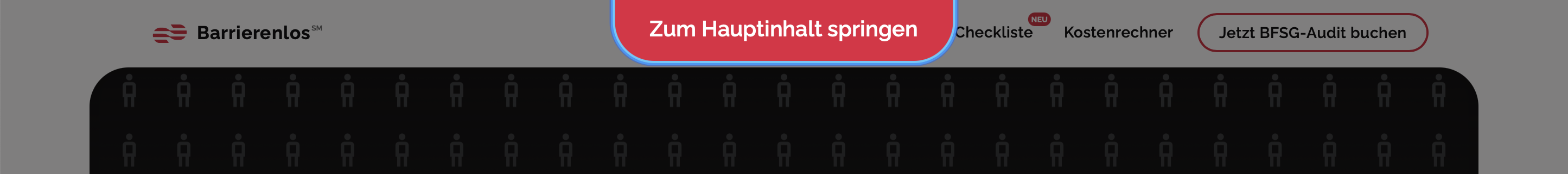
The first hidden navigation area serves as a "Skip Link" to allow users—especially those using assistive technologies—to jump directly to the main content. By using aria-label, the link's purpose is clearly communicated.
- HTML
- CSS
<nav aria-label="Skip target area">
  <ul class="stmc-links__wrapper">
    <li>
      <a href="#skip-link-target" title="Skip to main content" class="stmc-link"
        >Skip to main content
      </a>
    </li>
  </ul>
</nav>
.stmc-link,
.stmc-link:visited {
  position: absolute;
  top: 0;
  left: 50%;
  transform: translate(-50%, -100%);

  z-index: -1;
  opacity: 0;

  &:focus {
    top: 0;
    opacity: 1;

    transform: translate(-50%, 0);
    z-index: 99999999;
  }
}

.stmc-links__wrapper {
  position: absolute;

  z-index: -1;
  inset: 0;
  opacity: 0;

  &:focus-within {
    opacity: 1;
    z-index: 9999999;
  }
}
Alternatively, you can simply place a link as the first element on the page [40]:
- HTML
<a href="#skip-link-target" title="Skip to main content" class="stmc-link">
  Skip to main content
</a>
To-Dos:
- Ensure that the link is visible and clearly recognizable when navigating with the keyboard.
- Check whether the jump target area (
id="skip-link-target") is correctly defined and immediately follows the main content.
Met: Page Titled – WCAG 2.2, 2.4.2 (A)
- Does every page have a meaningful title that conveys the topic or purpose? (The
<title>"Inaccessible Course Platform - Demo v2" is present) [41]
Met: Focus Order – WCAG 2.2, 2.4.3 (A)
- Is the focus order logical so that meaning and operability are not impaired? (The order seems logical within the focusable elements) [42]
Not Met: Link Purpose (In Context) – WCAG 2.2, 2.4.4 (A)
- Is the purpose of each link unambiguous via the visible link text or the programmatically defined context?
The purpose of elements intended for navigation is often not programmatically determinable or is obscured by the use of semantically incorrect elements. This prevents users of assistive technologies from correctly identifying navigation options and understanding where a click leads [43].
Navigation Purpose Not Programmatically Determined (Divs instead of Links)
The main navigation and the links in the footer use <div> or <span> elements instead of actual links (<a>). Although the visible text (e.g., "Features," "Privacy Policy") may be understandable to sighted users, these elements lack the semantic role of a link. Assistive technologies do not recognize them as navigation elements, and the purpose ("navigate to another page/section") is not programmatically evident.


- Code of the problematic area (Navigation)
- Code of the problematic area (Footer)
<div class="main-nav">
  <div>Features</div>
  <div>Pricing</div>
</div>
```html
<div class="footer-links">
  <span>Privacy Policy</span> <span>Terms of Service</span>
</div>
Only a correctly implemented <a> element with an href attribute clearly signals the role and purpose of a hyperlink [44]. The link text itself should then describe the target or function of the link [43].
- Code as it should be (Navigation)
- Code as it should be (Footer)
<nav aria-label="Main navigation">
  <ul class="main-nav">
    <li>
      <a href="#features">Features</a>
    </li>
    <li>
      <a href="#pricing">Pricing</a>
    </li>
    <li>
      <a href="#testimonials">Testimonials</a>
    </li>
  </ul>
</nav>
<nav aria-label="Legal notices and service">
  <ul class="footer-links">
    <li>
      <a href="/privacy-policy">Privacy Policy</a>
    </li>
    <li>
      <a href="/terms-of-service">Terms of Service</a>
    </li>
  </ul>
</nav>
To-Dos:
- Implement all elements intended for navigation (header navigation, footer links) as correct
<a>elements with validhrefattribute and meaningful link text. - Ensure that these links are embedded in a semantically correct structure (e.g.,
nav > ul > li > a).
Buttons Used for Pure Navigation (Buttons instead of Links)
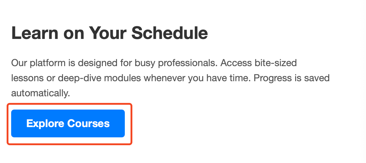
In several places, <button> elements are used for Call-to-Actions (CTAs) whose primary function is navigation to another page or section (e.g., "Get Started Today," "Explore Courses").

Semantically, a <button> is intended for actions within the current page (submitting a form, changing state, opening a dialog). For pure navigation, a link (<a>) is the correct element [44]. The use of a button conveys a false expectation about the action to be performed to assistive technologies.
Although the button text may be clear, the role="button" signals an action, not navigation. This can be confusing. If the click leads the user to another URL or an anchor on the page, an <a> element should be used and styled to look like a button.
- Code of the problematic area:
- Code as it should be:
<button class="cta-button">Get Started Today</button>
<button class="section-cta-button">Explore Courses</button>
<a href="/signup" class="cta-button button-like">
  Get Started Today
</a>
<a href="/courses" class="section-cta-button button-like">
  Explore Courses
</a>
To-Dos:
- Review all
<button>elements on the website. - Replace buttons whose main function is navigation to another URL or an anchor with
<a>elements with the correspondinghrefattribute. - Ensure that the link text clearly describes the purpose or destination of the link.
- Transfer the visual appearance of buttons to the
<a>elements via CSS if necessary.
Not Met: Multiple Ways – WCAG 2.2, 2.4.5 (AA)
- Do you offer multiple navigation paths (e.g., search, sitemap, menu) to find pages?
The website only offers a primary navigation (in the header, which is also inaccessible) and a rudimentary link collection in the footer (which is also inaccessible). There is no sitemap and no search function. Thus, alternative ways to find content are missing, especially if the main navigation is not usable [45], [46], [47].
To-Dos:
- Provide at least one more way to navigate. Options:
- Create and link a sitemap page.
- Implement a search function.
- Ensure that the main navigation and footer navigation consistently link all important pages.
Not Met: Headings and Labels – WCAG 2.2, 2.4.6 (AA)
- Are headings and labels meaningful and describe the topic or purpose?
Several headings and form labels on the page are not semantically correctly implemented, which makes navigation and comprehension difficult for users of assistive technologies [48], [49]. This particularly affects:
- Headings: As described under 1.3.1, no genuine heading tags (
<h1><h6>) are used. Styled<div>s do not fulfill the purpose of programmatically structuring the page [12]. - Labels: As described under 3.3.2, the form fields in the contact area lack explicit
<label>elements. Placeholders are not adequate labels [16].
To-Dos:
- Use genuine, hierarchically correct headings (
<h1>to<h6>) for all sections and subsections. - Provide explicit, correctly linked
<label>elements for all form fields.
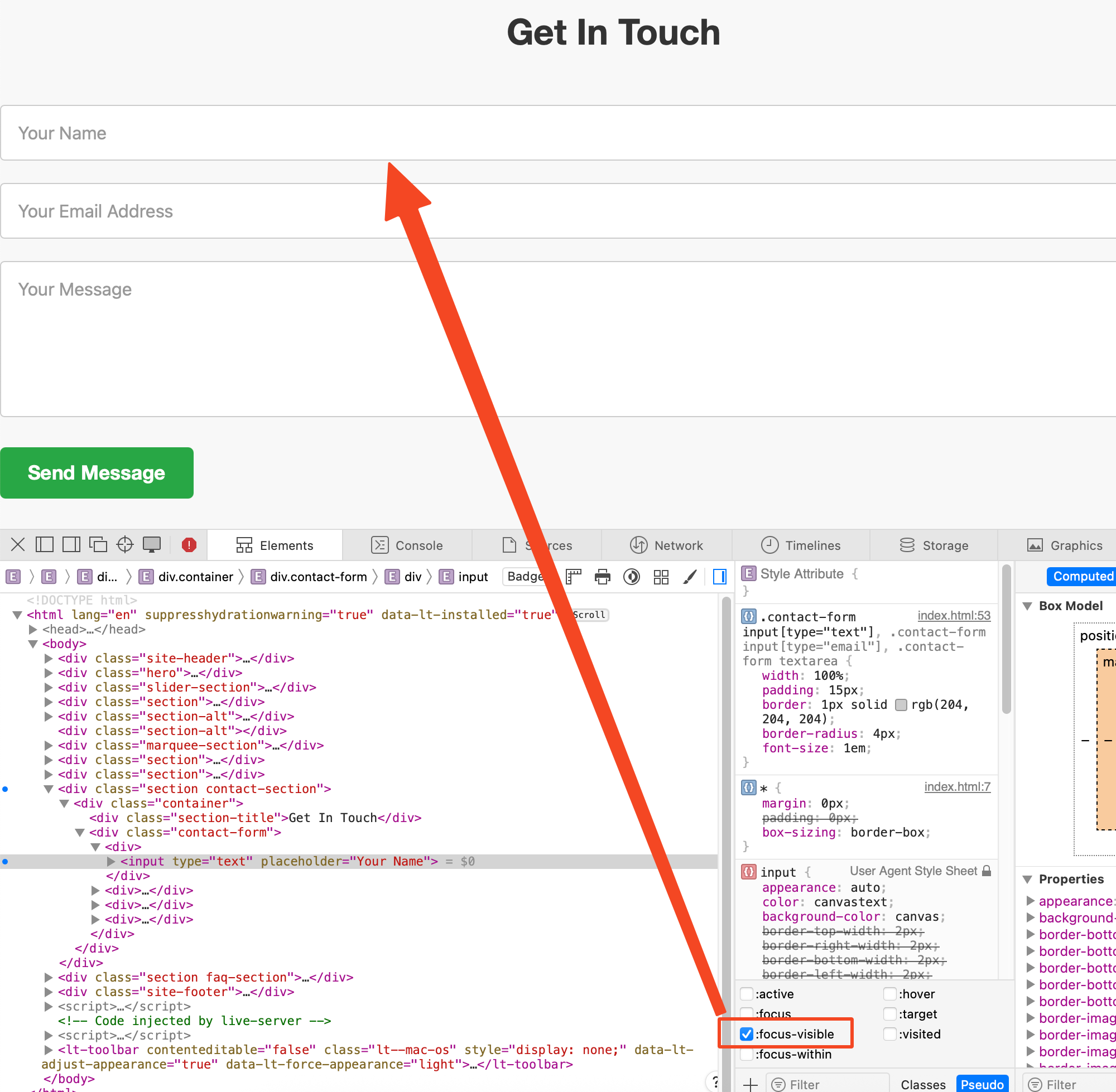
Not Met: Focus Visible – WCAG 2.2, 2.4.7 (AA)
- Is the keyboard focus visible when you navigate through the page?
The page's CSS lacks explicit :focus-visible styles for all interactive elements [50]. This affects:
- The
<div>elements in the navigation (which are not focusable anyway). - The
<button>elements (Hero CTA, Form Submit, Section CTAs). - The
<input>and<textarea>fields in the contact form. - The
<div>elements of the FAQ questions (which are also not focusable).
Without a visible focus indicator, keyboard users do not know which element is currently active, which makes operation extremely difficult or impossible [50].
To-Dos:
- Define clearly visible
:focusstyles for all interactive elements (links, buttons, form fields, etc.) in the CSS. The focus indicator must clearly stand out from the background and the element itself (see also 1.4.11 Non-text Contrast). A simpleoutlineis often sufficient, e.g.:
button:focus-visible,
input:focus-visible,
textarea:focus-visible,
a:focus-visible,
[tabindex='0']:focus-visible {
  outline: 2px solid blue; /* Example */
  outline-offset: 2px;
}
Met: Focus Not Obscured (Minimum) – WCAG 2.2, 2.4.11 (AA)
- Is the focus indicator not obscured by other content when an element receives focus? (No sticky headers/footers or non-modal dialogs present that would obscure the focus)
Make Your Website Accessible for All Input Methods.
Met: Pointer Gestures – WCAG 2.2, 2.5.1 (A)
- Can all multi-finger or path gestures (e.g., swiping, pinch-to-zoom) also be operated simply with a single pointer? (No such gestures required)
Met: Pointer Cancellation – WCAG 2.2, 2.5.2 (A)
- Is an action only completed upon pointer up (MouseUp / TouchEnd) or is there an undo/cancel option? (Standard behavior of buttons/inputs) [51]
Not Met: Label in Name – WCAG 2.2, 2.5.3 (A)
- Does the visible text in the label match the accessible name?
Since the fields do not have visible <label> elements, this criterion cannot be met. The accessible name (which would be provided by a label) is missing [16], [52]. Placeholders do not count as a label.
To-Dos:
- Add visible
<label>elements for all form fields (see 3.3.2). Ensure that the text in the label clearly describes the purpose of the field.
Met: Motion Actuation – WCAG 2.2, 2.5.4 (A)
- Can device movements (e.g., shaking) also be executed via a user interface component and do you deactivate unintended triggers? (No motion-activated functions) [53]
Met: Dragging Movements – WCAG 2.2, 2.5.7 (AA)
- Can the function that requires dragging (Drag & Drop) also be executed without dragging? (No Drag & Drop present)
Met: Target Size (Minimum) – WCAG 2.2, 2.5.8 (AA)
- Are all clickable/touchable areas at least 24x24 CSS pixels large or sufficiently separated? (Visually, the buttons and links (if they were links) seem large enough or far enough apart)
Is Your Website Understandable for All Users?
Your website should be designed so that all users can understand the content and operation [3]. This includes clear language, simple navigation, and understandable interactions. Pay particular attention to ensuring that screen readers pronounce the language correctly and that operation is logical.
Make Your Website Readable for All Users.
Met: Language of Page – WCAG 2.2, 3.1.1 (A)
- Is the page's default language correctly marked (e.g.,
lang="de")? (lang="en"is set in the HTML, which corresponds to the content's language) [54]
Met: Language of Parts – WCAG 2.2, 3.1.2 (AA)
- Do you mark language changes in the text (e.g., quotes, foreign words, customer reviews, etc.) with
langattributes? (No obvious language changes in the demo content) [55]
Make Your Website Predictable for All Users.
Met: On Focus – WCAG 2.2, 3.2.1 (A)
- Does the context not change automatically as soon as an element receives focus? [56]
Met: On Input – WCAG 2.2, 3.2.2 (A)
- Does the context not change automatically as soon as a value is changed in a form element? [57]
Met: Consistent Navigation – WCAG 2.2, 3.2.3 (AA)
- Are navigation elements that are repeated across multiple pages always arranged in the same order? (Since there is only one page, this is trivially met) [58]
Met: Consistent Identification – WCAG 2.2, 3.2.4 (AA)
- Are elements with the same function consistently labeled and identified (e.g., same icons, colors)? (Buttons have consistent styling) [59]
Not Met: Consistent Help – WCAG 2.2, 3.2.6 (A)
- Are help functions (contact, FAQ, chat, etc.) offered in the same location on all pages?
While the website offers an FAQ section and a Contact section, there is no consistent, easily discoverable mechanism for help that would be available on every (hypothetical) page (e.g., an always-present "Help" link in the header or footer). The links to the FAQ and Contact in the header are also inaccessible (see 2.1.1, 1.3.1).
To-Dos:
- Provide a consistent help mechanism on all pages. This could be a link to a help page, contact information, or an FAQ page, consistently placed in the same location (e.g., in the header or footer) and accessible [60], [61].
Help Users Avoid and Correct Mistakes.
Not Met: Error Identification – WCAG 2.2, 3.3.1 (A)
- Are input errors automatically detected and is the erroneous element communicated to the user and the error textually described?
The current contact form code contains no mechanisms for error detection or communication. If a user submits the form with errors (e.g., empty required fields, invalid email format), it is not ensured that:
- The error is detected at all (validation is missing).
- The erroneous field is programmatically marked as such (e.g., for screen readers) [62].
- A clear textual description of the error is provided and linked to the field [63], [64].
This results in users, especially those relying on assistive technologies, potentially not noticing that an error has occurred, which field is affected, or how to fix the error.
Problem Description using a Form Field Example
A typical input field in the current code offers no structure to display errors or communicate them programmatically.
To meet WCAG 3.3.1, upon validation (client- or server-side), the affected input field must be clearly identified, and the error described. This typically happens through:
- Visual highlighting (e.g., red border).
- Setting the
aria-invalid="true"attribute on the erroneous<input>element [62]. This signals the error state to assistive technologies. - Displaying a textual error message in the immediate vicinity of the field.
- Linking the
<input>element to the error message via thearia-describedbyattribute [65]. The attribute value must match theidof the element containing the error message. Screen readers typically read the label first, then the field type, and finally the error text linked viaaria-describedby.
- Problematic area
- Code as it should be:
<div>
  <input
    type="email"
    id="contact-email"
    name="contact-email"
    placeholder="Your Email Address"
  />
</div>
<div class="form-group has-error">
  <label for="contact-email">Your Email Address</label>
  <input
    type="email"
    id="contact-email"
    name="contact-email"
    placeholder="e.g. max@example.com"
    required
    aria-invalid="true"
    aria-describedby="email-error-message"
  />
  <div id="email-error-message" class="error-message" role="alert">
    Please enter your email address in the following format:
    example@email.com. This field is required.
  </div>
</div>
To-Dos:
- Implement client-side and/or server-side validation logic for the contact form (e.g., check for empty required fields, correct email format).
- When an error occurs: Dynamically set (e.g., via JavaScript) the
aria-invalid="true"attribute on the erroneous<input>or<textarea>element. - Display a clear, textual error message in the immediate vicinity of the erroneous field. Give this error message element a unique
id. - Add the
aria-describedbyattribute to the erroneous<input>/<textarea>element, whose value points to theidof the associated error message. - Ensure that the error is also visually clearly recognizable (e.g., through color, icon, highlighting of the field and/or the error message).
- Remove
aria-invalid="true"andaria-describedby(or hide the error message) as soon as the error has been corrected.
Not Met: Labels or Instructions – WCAG 2.2, 3.3.2 (A)
- Do all controls requiring user input have associated labels or instructions?
The input fields (<input>, <textarea>) in the contact form do not have explicit, programmatically linked <label> elements. Instead, placeholder attributes are used to suggest the purpose of the fields. This is problematic and insufficient for several reasons [16], [67]:
- Ephemerality: Placeholder text disappears as soon as the user starts typing, causing the information about the expected content to be lost.
- Detection by Assistive Technologies: Placeholders are not reliably recognized by all browser/screen reader combinations as the accessible name for the field [67]. However, the accessible name is crucial so that screen reader users know which field they are currently editing.
- Contrast: Placeholder text often has low color contrast to the background, making readability difficult for users with visual impairments.
- Purpose: Placeholders are primarily intended for short hints or format examples, not as a replacement for a permanent label.
Without correct labels, the essential programmatic link between the description and the input field is missing [16].
Problem Description and Code
The current code shows input fields without associated <label> elements.
The standard and most robust method for providing labels for form fields is using the <label> element. By linking the for attribute of the label to the id of the corresponding input element (<input>, <textarea>, <select>), a clear programmatic connection is established [16]. This connection allows assistive technologies to read the label correctly when the field receives focus. Additionally, mouse users benefit because clicking the label sets the focus into the associated input field.
- Problematic area
- Code as it should be:
<div class="contact-form">
  <div>
    <input type="text" placeholder="Your Name" />
  </div>
  <div>
    <input type="email" placeholder="Your Email Address" />
  </div>
  <div>
    <textarea rows="6" placeholder="Your Message"></textarea>
  </div>
  <div>
    <button class="submit-button" type="button">Send Message</button>
  </div>
</div>
<div class="contact-form">
  <div class="form-group">
    <label for="contact-name">Your Name</label>
    <input
      type="text"
      id="contact-name"
      name="contact-name"
      placeholder="e.g. Max Mustermann"
      required
      autocomplete="name"
    />
  </div>

  <div class="form-group">
    <label for="contact-email">Your Email Address</label>
    <input
      type="email"
      id="contact-email"
      name="contact-email"
      placeholder="e.g. [removed email address]"
      required
      autocomplete="email"
    />
  </div>
  <div class="form-group">
    <label for="contact-message">Your Message</label>
    <textarea
      id="contact-message"
      name="contact-message"
      rows="6"
      placeholder="What can we do for you?"
      required
    ></textarea>
  </div>
  <div>
    <button class="submit-button" type="submit">Send Message</button>
  </div>
</div>
To-Dos:
- Add a visible
<label>element for every<input>and<textarea>element in the contact form. - Give each input field a unique
id. - Set the
forattribute of each<label>element to theidof the corresponding input field to establish the programmatic link [16]. - If additional instructions are necessary (e.g., about required formats or lengths), provide them as visible text near the field (e.g., below the label or input) and link them additionally via
aria-describedbyif necessary (see also SC 3.3.1 [69] and 3.3.3). Use placeholders only for short, non-essential hints or examples.
Not Met: Error Suggestion – WCAG 2.2, 3.3.3 (AA)
- For empty required fields, do you offer a hint (e.g., "This field must not be empty")? (Error detection is generally missing, thus assumption: No)
- If a specific data format is required, do you suggest a correction?
- If only certain values are allowed (e.g., a selection list), do you provide a corresponding hint or suggestion? (No such fields present)
Since no error detection is implemented (see 3.3.1 [69]), no correction suggestions are made either [70]. If a user enters an invalid email address, for example, they would (presumably) not receive a specific message that helps them correct the error (e.g., "Please enter a valid email address in the format name@domain.com.").
Met: Error Prevention (Legal, Financial, Data) – WCAG 2.2, 3.3.4 (AA)
- For legally or financially relevant actions (e.g., purchase, tax return), do you offer options for modification or reversal? (Not applicable)
- If user data is deleted or changed, can it be undone or confirmed? (Not applicable)
- For tests (e.g., exams, questionnaires), do you give the opportunity to review or change answers before they are finally submitted? (Not applicable)
Met: Redundant Entry – WCAG 2.2, 3.3.7 (A)
- Do you avoid duplicate entries within a process or do you automatically fill in previously entered data? (Not applicable for the simple contact form)
Met: Accessible Authentication (Minimum) – WCAG 2.2, 3.3.8 (AA)
- Do you avoid purely cognitive testing steps (e.g., complicated passwords, riddles), or do you offer alternatives? (No authentication present)
Is Your Website Robust Enough?
The fourth and final cornerstone of accessibility is robustness [3].
This aspect ensures that your website remains compatible with future technologies and is correctly interpreted by a variety of user agents, including assistive technologies.
By paying attention to clean HTML and adhering to web standards, you increase the longevity and accessibility of your website.
Maximize Compatibility with All Technologies Users Employ.
Not Met: Parsing – WCAG 2.2, 4.1.1 (A)
- Are elements nested according to their specification, do they have start and end tags, and no duplicate attributes/IDs?
Although no explicit validation was performed, the massive semantic errors (use of div for everything) indicate that the HTML structure likely does not comply with the specifications for the correct use of elements. Valid parsing is probably given, but the correct application of HTML is fundamentally violated.
To-Dos:
- Check code with an HTML validator (e.g., W3C Nu HTML Checker).
- Use correct semantic elements (see 1.3.1).
Not Met: Name, Role, Value – WCAG 2.2, 4.1.2 (A)
- Do you use standardized UI components (e.g., HTML forms) according to the WHATWG HTML specification [74], so that Name/Role are recognizable?
- If you repurpose standard components or script new ones, do you ensure correct marking of Name/Role?
- If you use standard components in a programming language, do you ensure that Name/Role can be read out via API? (Not applicable)
- If you program your own UI components, do you expose Name/Role/State via ARIA or Accessibility APIs? (ARIA is not used)
This criterion is violated in many places [75], [76]:
- Navigation & Footer Links:
<div>and<span>are used instead of<a>. Role ("Link") is missing. - Headings:
<div>instead of<h1><h6>. Role ("Heading") is missing. - FAQ:
<div>is used as an interactive trigger instead of<button>. Role ("Button") and state (aria-expanded) are missing. - Form Fields: Missing<label>s result in the accessible name of the fields not being correctly determinable. - Slider/Marquee: No roles (e.g.,role="region",aria-live) or states defined that make the function understandable for assistive technologies. - Form Fields: Missing
<label>s result in the accessible name of the fields not being correctly determinable. - Slider/Marquee: No roles (e.g.,
role="region",aria-live) or states defined that make the function understandable for assistive technologies.
To-Dos:
- Use native HTML elements for their intended purpose (links, buttons, headings, lists, form elements).
- Where native elements are insufficient (e.g., for custom widgets like the FAQ accordion), implement correct ARIA roles, properties, and states (
role,aria-label,aria-expanded,aria-controls, etc.). - Ensure that all form fields receive an accessible name through correctly linked
<label>elements.
Not Met: Status Messages – WCAG 2.2, 4.1.3 (AA)
- Do you output status messages (e.g., "Success" or "Data saved") so that assistive technologies perceive them without receiving focus? (No status messages implemented)
- Do error messages or warnings (e.g., validation errors) also appear programmatically perceivable (
role="alert"or similar)? - Is a progress (e.g., loading bar) announced live via role or live region (e.g.,
role="progressbar"orrole="log")?** (No progress indicators implemented)
As described earlier, error handling is missing. If error messages are added, they must be implemented so that they are automatically perceived by assistive technologies (like screen readers) without the user having to manually move the focus there. This typically happens by using role="alert" or aria-live regions [77].
To-Dos:
- Place dynamically appearing status and error messages (e.g., after form submission) in a container with
role="alert"orrole="status"(depending on urgency) so that they are announced to screen readers.
Now, all 55 requirements of WCAG 2.2 have been checked on your website. The website failed to meet 20 out of 55 WCAG 2.2 criteria. Therefore, your website does not yet have a presumption of conformity [78].
All To-Dos Summarized
Image Alternatives & Media
Alt Text / Decorative Images
- Create meaningful alternative texts for all informative images (Hero, Slider, Features, Alternating Sections, How it Works) and include them in the
altattribute [4], [5]. - Check whether individual images are actually purely decorative and explicitly mark them with
alt=""[6].
Semantic Structure & HTML Errors
HTML Validation & Structure
- Check code with an HTML validator (e.g., W3C Nu HTML Checker) and fix errors [71].
- Use correct semantic HTML elements for the page structure (
<header>,<nav>,<main>,<section>,<footer>,<article>) [10]. - Mark headings hierarchically correctly with
<h1>-<h6>[12], [13].
Lists & Groupings
- Structure navigation menus, feature lists, step lists, FAQ lists, etc., as HTML lists (
<ul>/<ol>with<li>) [14].
Sections & Landmarks
- Check all important content sections and mark them as Landmarks using
aria-labeloraria-labelledbyif native elements like<nav>,<main>are insufficient [10].
ARIA Attributes & Interactive Elements
Optimize Interactive Elements
- Implement interactive elements (navigation links, FAQ triggers, footer links) as native links (
<a>withhref) or buttons (<button>) [31], [44]. - Use ARIA attributes (
aria-expanded,aria-controls,role="region"for content) for interactive components like the FAQ accordion [15]. - Place dynamically appearing status and error messages (e.g., after form submission) in a container with
role="alert"orrole="status"[77].
Navigation & Keyboard Accessibility
Quick Access & Navigation
- Implement a "Skip-to-Content" link as the first focusable element (visually hidden until focused) [40].
- Ensure that the purpose of each link (via visible link text or ARIA attributes) is unambiguously recognizable (after conversion to
<a>) [43]. - Provide at least one more way to navigate (sitemap, search, or consistent menus) [45], [46], [47].
Focus & Keyboard Operation
- Define clearly visible
:focusstyles for all interactive elements (links, buttons, form fields, etc.) in the CSS [50]. - Ensure that all interactive elements are reachable and operable via the keyboard (navigation, FAQ, slider/marquee controls) [31].
Contrast, Design & Visual Requirements
Text & Non-text Contrast
- Adjust color contrasts for text (placeholders, buttons, Hero) according to WCAG AA (4.5:1 for normal text, 3:1 for large text) [23], [24].
- Ensure contrast for user interface components (form field borders, focus indicator) according to WCAG AA (3:1) [28], [29].
Animation & Motion
- Add controls for the slider and marquee to stop/pause, which are keyboard operable [34], [35].
- Respect the CSS media query
prefers-reduced-motionand disable animations if necessary.
Forms & Input Fields
Labeling & Input Purpose
- Add a visible
<label>element for every input field in the contact form and link it correctly (for/id) [16]. - Add appropriate
autocompleteattributes for fields like Name (name) and Email (email) [20].
Error Handling
- Implement robust error handling for the contact form [63].
- Programmatically mark erroneous fields (
aria-invalid="true") [62]. - Provide error messages textually, link them to the field (
aria-describedby) [65], and offer correction suggestions [70]. - Announce error messages to screen readers via
role="alert"or similar [77].
Miscellaneous & System-Wide Measures
Help
- Provide a consistent help mechanism on all pages (e.g., link to FAQ/Contact in the footer) [60].
Documentation
- Create and publish an (honest) accessibility statement on the website.
If you implement all these To-Dos, your website will very likely achieve the presumption of conformity.
Conclusion
A total of 55 individual criteria from WCAG 2.2 A and AA were checked, which are necessary for compliance with legal requirements [1].
- Met Criteria: 35
- Not Met Criteria: 20
The website exhibits severe deficiencies in terms of accessibility and is far from meeting the requirements of WCAG 2.2 AA [78]. The problems run through all four principles of accessibility (Perceivable, Operable, Understandable, Robust) [3]:
- Perceivable: Missing text alternatives for images, insufficient color contrasts, flawed semantic structure that obscures relationships and information.
- Operable: Important parts of the website (navigation, FAQ) are not keyboard operable, focus is not visible, moving content (slider, marquee) cannot be stopped, and a Skip Link is missing.
- Understandable: Forms are not correctly labeled, errors are not communicated or inadequately communicated, and alternative navigation paths and consistent help are missing.
- Robust: The incorrect use of HTML and the lack of ARIA where necessary mean that assistive technologies cannot interpret the page correctly.
This demo website is highly inaccessible in its current state. However, it illustrates typical barriers that can occur in real web projects very well. Implementing the listed To-Dos would require a fundamental overhaul of the code base, particularly the introduction of correct semantic HTML structures and the implementation of standard interaction patterns for navigation, forms, and dynamic content.
I hope this report helps you understand the identified barriers and shows the necessary steps for improving accessibility. Please feel free to contact me if you have any questions.
Liability
- No Legal Substitute: This audit does not constitute legal advice. All content and recommendations have been carefully reviewed and prepared to the best of our knowledge, but no guarantee can be given for completeness, timeliness, and correctness.
- Responsibility for Implementation: The client is solely responsible for the proper, complete, and correct implementation of the recommendations.
- Scope of Liability: Any liability is limited to intentional or grossly negligent conduct. In particular, claims for damages caused by slight negligence are excluded.
Should you have questions regarding the license scope, the use of the content, or liability, please feel free to contact me.
About the author