Accessible Carousel: Step-by-Step Guide
Information about the article

Author: Dmitry Dugarev
The following guide shows you the requirements for your carousel to meet accessibility standards. For each section, there is a code example and a checklist to tick off.
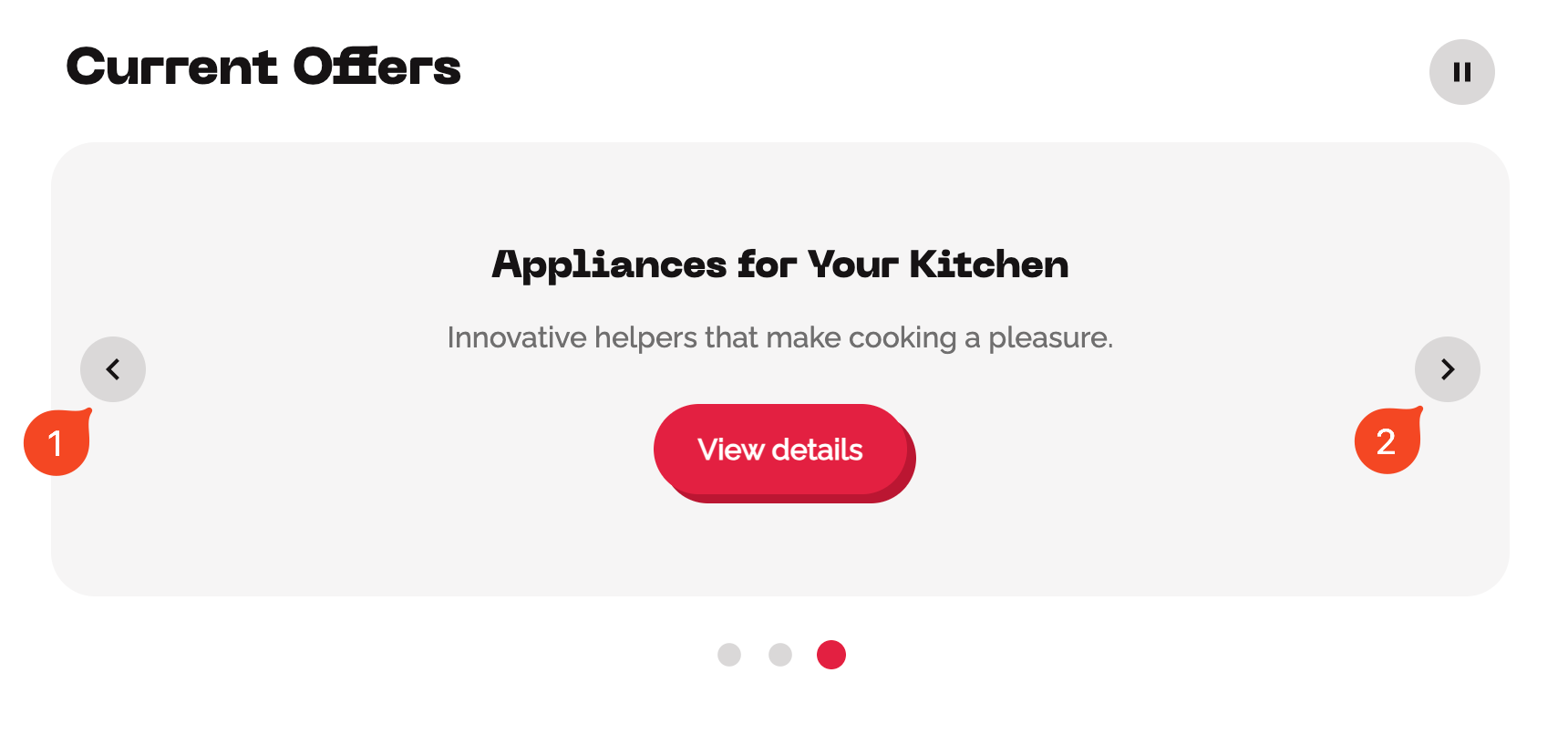
Here you see an example of a fully accessible carousel:
Live Demo
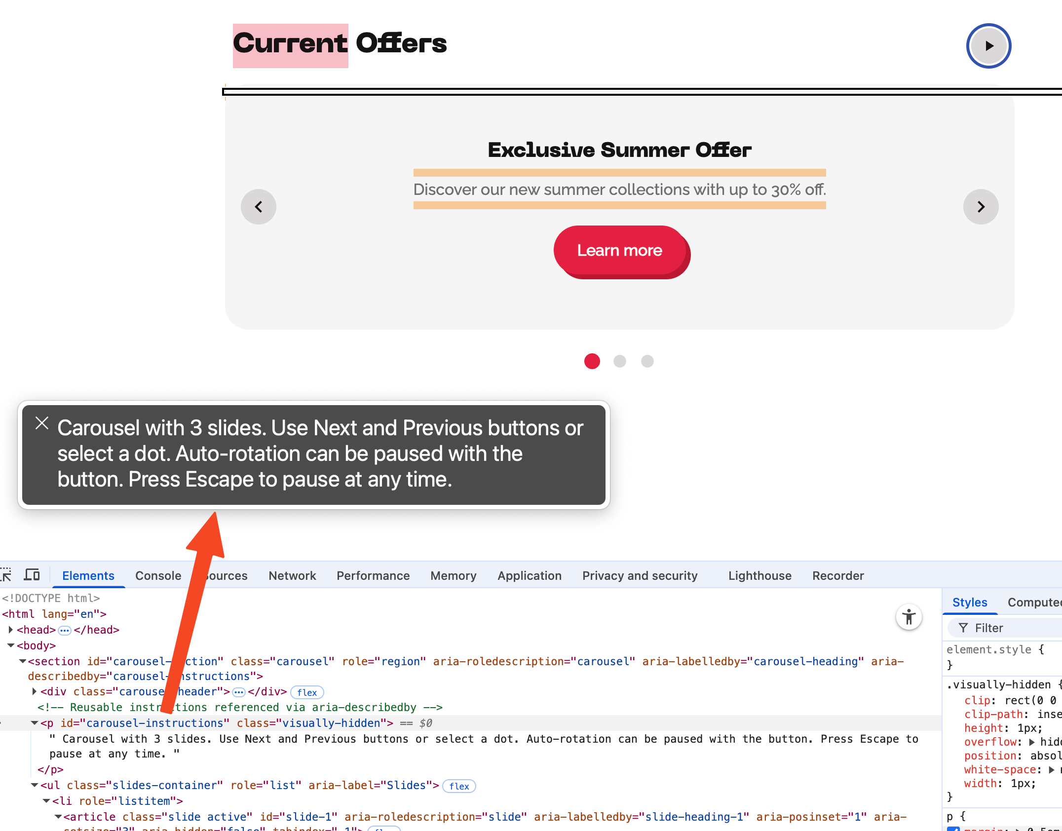
Carousel with 4 slides. Use the "Next" and "Back" buttons or select a dot. Automatic rotation can be paused with the button. Press the Escape key at any time to stop.
Basic Structure for the Carousel
The entire carousel should be recognizable as its own region on the page [1]. Without this identification, it is difficult for users navigating via landmarks to find, and its purpose remains unclear [2].

Open textual description for "Schematic Representation of the Basic Structure of an Accessible Carousel"
This diagram shows the essential components that make up an accessible carousel. All elements are arranged within a main region.
-
Main region: A section with a unique ID and the attribute
aria-roledescription. -
Heading: A heading with a unique ID that is linked to the main region using
aria-labelledby. -
Slide list: A list containing the slides.
- Slides: Each slide is a list item that includes the actual content (e.g., inside an
articleelement). Hidden slides are marked witharia-hidden="true".
- Slides: Each slide is a list item that includes the actual content (e.g., inside an
-
Control elements:
- A list with arrow buttons (for sequential navigation).
- A radio group with dots (for direct selection).
- A pause button (to control automatic rotation).
- A region for status messages (for screen readers).
Here I show you an example of the basic structure:
<section
  id="carousel-section"
  class="carousel"
  aria-roledescription="Karussell"
  aria-labelledby="carousel-heading"
>
  <h2 id="carousel-heading">Current Offers</h2>
</section>
We wrap the carousel in a <section> [1]. With aria-labelledby [3], you point to a visible heading (the <h2>), which makes the <section> a named region. aria-roledescription="Karussell" [4] whispers to the screen reader exactly what this is (namely a 'Carousel'), and this is best done in the user's language [5].
Checklist for the Basic Structure:
- Have you enclosed the carousel in a
<section>element [1] witharia-roledescription="Carousel"[4] for description for screen readers? - If your website is multilingual, is the value of
aria-roledescriptionlocalized to the user's language? [5] - Does your carousel have a heading with a unique ID? [6]
- Does the carousel section have an
aria-labelledbyattribute pointing to the heading's ID? [3]
Slide Container
The slides are a group of things that belong together. Therefore, you should mark them up as a list [7]. If you simply put the slides in <div>s, screen readers can neither recognize the number nor understand how they relate [8].
Here is an example of the structure of the slide container:
<ul class="slides-container" aria-label="Folien">
  <li></li>
  <li></li>
</ul>
You structure the slides as list items (<li>) within an unordered list (<ul>) [7]. This allows screen readers to recognize the number of slides and understand their relationship [8].
Checklist for the Slide Container:
- Are your carousel slides contained within a
<ul>element, with each slide enclosed in an<li>element? [7], [8] - Does the
<ul>element have anaria-labelto describe the list of slides [9]?
Content of the Slides
You should build each slide as a separate section with a clear structure and the correct ARIA attributes so that its role and position in the carousel are clear [8].
Here is an example of the structure of the slides in a carousel:
<ul class="slides-container" aria-label="Folien">
  <li>
    <article
      class="slide active"
      id="slide-1"
      aria-roledescription="Folie"
      aria-labelledby="slide-heading-1"
      aria-posinset="1"
      aria-setsize="3"
      aria-hidden="false"
      tabindex="-1"
    >
      <h3 id="slide-heading-1" tabindex="-1">Exclusive Summer Offer</h3>
      <p>Discover our new summer collections with up to 30% off.</p>
      <a href="#" class="cta-button">
        <span class="visually-hidden">Exclusive Summer Offer — </span>Learn more
      </a>
    </article>
  </li>

  <li>
    <article
      class="slide"
      id="slide-2"
      aria-roledescription="Folie"
      aria-labelledby="slide-heading-2"
      aria-posinset="2"
      aria-setsize="3"
      aria-hidden="true"
      tabindex="-1"
      inert
    >
      <h3 id="slide-heading-2" tabindex="-1">New: Our Outdoor Gear</h3>
      <p>Perfect for your next outdoor adventure. Sturdy and durable.</p>
      <a href="#" class="cta-button">
        <span class="visually-hidden">New: Our Outdoor Gear — </span>Learn more
      </a>
    </article>
  </li>
</ul>
The content of each slide is contained in an <article> element, which gives the whole thing a semantic structure [1]. Each <article> should have the attributes aria-roledescription="Slide" [4], aria-posinset, and aria-setsize [8].
This is how you communicate the role and position. You do this because some browsers and screen readers do not automatically derive aria-posinset and aria-setsize from the <ul> list, especially if you dynamically change slides or if the CSS distorts the list. Hidden slides are marked with aria-hidden="true" and inert so that they are removed from the Accessibility Tree [10].
Checklist for the Slide Content:
- Have you placed the slide content in an
<article>element to provide semantic structure? [1] - Does each slide have the attribute
aria-roledescription="Slide", to announce its description for screen readers? [4] - If your website is multilingual, is the value of
aria-roledescriptionlocalized to the user's language? [5] - Does each slide have a heading with a unique ID [6]?
- Does each slide have an
aria-labelledbyattribute pointing to the heading's ID to make it a named region [3]? - Does each slide have the attributes
aria-posinsetandaria-setsizeto additionally communicate its position and the total number of slides? [8] - Are hidden slides marked with the attributes
aria-hidden="true"andinertordisplay: noneto prevent them from being announced or interacted with by screen readers and keyboard users? [10]
Focus Management
Clean focus management ensures that users know where they are when a slide changes [11]. This is extremely important for everyone using assistive technologies.

After every manual slide change, you must programmatically set the focus to the first element of the new slide (for example, the heading within the slide) [12].

Open textual description for "Logic of Focus Management After Slide Change"
This flowchart describes the sequence of steps required for correct focus management after a manual slide change in a carousel.
- The user initiates the change (e.g., "User clicks 'Next'").
- A JavaScript event triggers the slide transition ("JavaScript event: start slide transition").
- The visual animation begins ("Animation running").
- The animation finishes ("Animation completed").
- The new slide is programmatically marked as active ("New slide is marked as active (.active)").
- The first focusable element of the new slide (e.g., a heading
<h3>) is identified ("Find first focusable element"). - Focus is set on this element using the
.focus()method ("Set focus via .focus()"). - The screen reader announces the content of the new slide ("Screen reader announces new slide content").
Here is a snippet of what this might look like in JavaScript:
// Example logic after changing to the new slide
const newSlide = document.querySelector('.slide.active');
const focusableElement = newSlide.querySelector('h3');
focusableElement.focus();
Checklist for Focus Management:
- Does the focus move to the heading of the current slide after clicking a navigation button so that it can be announced by the screen reader? [12], [11]
- When a slide change occurs, does the focus move to the new slide only after the transition animation is complete, and not before, to avoid interrupting the announcement? [13]
Controls for Automatic Rotation
Rotation that you cannot control is totally distracting and does not give people enough time to read the content. This directly violates WCAG [14]. Therefore, all carousels with auto-rotation must meet these requirements:
- Pause/Play Button: You need a visible and keyboard-operable button to stop and resume the animation [15]. Its
aria-labelmust change dynamically (e.g., "Pause animation" / "Start animation").
Example of Button to Control Automatic Rotation - Pause on Interaction: The rotation must automatically pause as soon as you hover the mouse over the carousel (
mouseenter) or focus an element within it (focusin) [14]. - Respect
prefers-reduced-motion: The animation should be disabled from the start if the user requests reduced motion in their operating system.

Open textual description for "States of Automatic Rotation"
This state diagram shows the various states of automatic carousel rotation and the transitions between them.
-
The starting state is Idle (rotation off).
-
From Idle, the system transitions to AutoRotate (rotation active) via the action "Start rotation".
-
From AutoRotate, the system can transition to two states:
- To Paused (paused) via the actions "Click on pause" or "Focus or mouse over carousel".
- To RespectReducedMotion (reduced motion) via the action "prefers-reduced-motion active".
-
From Paused, the system transitions back to AutoRotate via the action "Click on play".
-
The RespectReducedMotion state transitions back to Paused when appropriate.
Furthermore, the automatic rotation must pause when you interact with the carousel:
Checklist for Controlling Automatic Rotation:
- Is there a way to stop the automatic rotation, e.g., a "Pause" button? [14], [15]
- Is the automatic rotation button implemented as a
<button>element [10] witharia-label[9] andtitleattributes [16] for screen reader announcement and tooltips? - Does the automatic rotation button have an
aria-pressedattribute to indicate its state (on/off), with appropriately updated labels and titles? [17] - Is the automatic rotation button focusable and operable with the keyboard (using
EnterorSpacebar)? [18] - Does the automatic rotation button have a distinguishable focus style [19] with a contrast ratio of at least 3:1 to the background? [20]
- Does the automatic rotation button have a contrast ratio of at least 3:1 to the background for visibility? [20]
- Does the automatic rotation button have sufficient size (at least 44x44 pixels) to facilitate operation? [21]
- Does the automatic rotation stop when you hover the mouse over the current slide or focus it, to allow uninterrupted interaction with the content? [14]
- Does the automatic rotation stop when one of the carousel's slide control buttons is hovered over or receives focus? [14]
- Does the automatic rotation respect the user's
prefers-reduced-motionsetting and disable animations accordingly? [14]
Arrow Buttons
You navigate the carousel using arrow buttons. You must implement the "Next" and "Previous" buttons as real buttons. Far too often, I see <a> tags with href="#" being misused for this purpose. This is semantically incorrect [22], does not work reliably with the keyboard (especially in Safari), and does not work with the Spacebar [18]. Therefore: use <button> elements. It is important that you clearly label them and make them accessible [10].
Here is an example of the structure of the arrow buttons:
<ul class="carousel-navigation" aria-label="Sequential Navigation">
  <li>
    <button
      type="button"
      id="prev-btn"
      class="carousel-btn"
      aria-label="Previous Slide"
      title="Previous Slide"
    ></button>
  </li>
  <li>
    <button
      type="button"
      id="next-btn"
      class="carousel-btn"
      aria-label="Next Slide"
      title="Next Slide"
    ></button>
  </li>
</ul>
We use native <button> elements. They are focusable and operable by default [18]. An aria-label [9] gives them an accessible name that describes their function (e.g., "Next Slide"). Icons (SVG or <img>) are hidden with aria-hidden="true", as they are only decorative [23].
Checklist for the Arrow Buttons:
- Are your arrow navigation buttons implemented as a
<ul>element [7] with anaria-label[9] to describe the controls? - Are the arrow navigation buttons consistently placed at the beginning or end of the carousel before the dot navigation for easy access? [24]
- Are the arrow navigation buttons implemented as
<button>elements [10] witharia-label[9] andtitleattributes [16] for screen reader announcement and tooltips, if they do not have visible text labels? - Are the arrow navigation buttons focusable and operable with the keyboard (using
EnterorSpacebar)? [18] - Do the arrow navigation buttons have a distinguishable focus style [19] with a contrast ratio of at least 3:1 to the background? [20]
- Do the arrow navigation buttons have a contrast ratio of at least 3:1 to the background for visibility? [20]
- Do the arrow navigation buttons have sufficient size (at least 44x44 pixels) to facilitate operation? [21]
- If the arrow buttons use icons, are these icons decorative and marked with
aria-hidden="true"? [23]
Dot Navigation
Dot navigation allows your users to select specific slides. You must, of course, build this function accessibly too.

This is not just about a click, but about selecting an option from a group. If you build this using simple <div>s or <button>s, the semantics of a selection group where only one option can be chosen are missing [8]. Keyboard navigation with arrow keys won't work [18], and the current state also won't be reported [10].
The semantically cleanest and most robust solution is to implement the whole thing as a Radio Button Group. Radio buttons inherently bring the correct semantics [10] and keyboard navigation.
- You wrap the group in a
<fieldset>with a<legend>[25] to label the selection group. - Each dot is an
<input type="radio">with an associated<label>[26]. - To allow styling, you visually hide the real radio buttons (
visually-hidden) and style the<label>elements as clickable dots. - To prevent screen readers from reading both (double announcement), the
inputgets a cleararia-label(e.g., "Slide 1") [9], and you hide thelabelwitharia-hidden="true"for screen readers.
Here is an example of the structure of the dot navigation:
<fieldset class="carousel-dots">
  <legend class="visually-hidden">Slide Selection</legend>

  <input
    type="radio"
    id="dot-1"
    name="carousel-dots"
    class="visually-hidden"
    aria-label="Slide 1"
    checked
  />
  <label for="dot-1" class="carousel-dot-label" aria-hidden="true">
    <span class="visually-hidden">Slide 1</span>
  </label>

  <input
    type="radio"
    id="dot-2"
    name="carousel-dots"
    class="visually-hidden"
    aria-label="Slide 2"
  />
  <label for="dot-2" class="carousel-dot-label" aria-hidden="true">
    <span class="visually-hidden">Slide 2</span>
  </label>
</fieldset>
Checklist for Dot Navigation:
- Are the navigation dots placed within a
<fieldset>element with an appropriate<legend>element to provide a label that is announced by screen readers? [25], [8] - Are the navigation dots implemented as radio buttons [10] to support selection and keyboard navigation (e.g., with arrow keys)? [18]
- Do the navigation dots support the
HomeandEndkeys to navigate to the first and last slide, and optionally theArrowDownandArrowUpkeys to navigate to the next/previous slide? [18] - Do the navigation dots have an
aria-labelattribute [9] or a corresponding text label [26] for screen reader announcement? - Are the navigation dots visually distinguishable when focused [19], with a focus style that has a minimum contrast ratio of 3:1 to the background? [20]
- Is the currently active dot visually highlighted and announced by screen readers? [10]
- Is the currently active dot programmatically distinguishable? [10]
Announcing Slide Changes for Screen Readers
If a user manually changes the slide using the arrow buttons, they currently receive no feedback about which slide is now active.
For this, we need a "Live Region" that announces changes [13]. You fill a visually hidden element with aria-live="polite" and aria-atomic="true" using JavaScript with the new status (e.g., "Slide 2 of 3"). This should be communicated as a status message.
Important: Only do this for manual changes using the arrow buttons, to avoid sensory overload during automatic rotation or when consciously selecting via the dots.
Here is an example of a live region:
<div
  id="slide-change-region"
  class="visually-hidden"
  role="status"
  aria-live="polite"
  aria-atomic="true"
></div>
Checklist for Announcing Slide Changes:
- Is there a visually hidden element with
aria-live="polite"andaria-atomic="true"that announces the current slide status (e.g., "Slide 2 of 5")? [13] - Does the live region have
role="status"to inform screen readers that it is a status message? [28] - Is the announcement of the live region triggered after the focus has been moved to the new slide, to ensure the screen reader announces the content correctly and without interruption? [13]
- Do you avoid announcing the current slide during automatic rotation, as the user is not actively navigating? [13]
- Is the live region only updated during manual slide changes (e.g., via arrow buttons) to avoid sensory overload? [13]
Visual and Keyboard Focus
It is truly crucial that all your interactive elements have a clear visual focus indicator [19]. This greatly helps keyboard and screen reader users.
Checklist for Visual and Keyboard Focus:
- Do all interactive controls (navigation dots, arrow buttons, pause button) have a distinguishable focus style [19] with a contrast ratio of at least 3:1 to the background? [20]
- Do all interactive controls (navigation dots, arrow buttons, pause button) have a contrast ratio of at least 3:1 to the background for visibility? [20]
Instructions for Accessible Interaction
Providing instructions for interacting with the carousel [29] improves accessibility by giving users of assistive technologies guidance.
Checklist for Interaction Instructions:
- Is there a text element in the carousel that contains instructions for interaction? You can hide it visually. [29]
- Is the instruction connected to the carousel via
aria-describedbyso that it is announced when the carousel is focused? [30] - Is the instruction connected to each slide via
aria-describedbyso that it is announced when the slide is focused? [30]
Conclusion
Accessible carousels are not a "nice-to-have," but a strict prerequisite for an inclusive user experience and compliance with WCAG 2.2 requirements. This guide hopefully shows you that accessibility cannot be reduced to a bit of cosmetic work: it arises from a semantically correct structure [8], complete keyboard operability [18], reliable focus management [11], controllable animation [14], clear status messages [13], and well-thought-out user guidance.
The central point is: Carousels are complex, interactive components with many states. Only the combination of landmark structure (i.e., section with a named heading [2]), a clear role description (aria-roledescription [4]), visible and programmatically recognizable states (e.g., active slide, paused rotation) [10], as well as robust navigation patterns (buttons instead of misused links [22], radio group for dots [25]) makes it possible for assistive technologies to reliably convey the interaction.
For practical use, Progressive Enhancement (ensure it roughly works without JavaScript), Internationalization (localized labels, especially aria-roledescription) [5], respect for system preferences (prefers-reduced-motion) [14], and a testable design are also important. If you systematically implement these aspects, you break down barriers, increase the satisfaction of all users—and reduce your maintenance and support costs in the long run.
Use this checklist to verify your carousel implementation and make necessary adjustments. Regular testing with real users, including people with disabilities, can also give you incredibly valuable insights into how your carousel is received.
Frequently Asked Questions (FAQ) about Accessible Carousels
Why is focus management so important for carousels?
Focus management ensures that assistive technologies like screen readers can announce the new slide upon a slide change without you having to manually navigate back there. This is crucial for users who rely on keyboard navigation or screen readers to understand the carousel's content [11].
How can I test if my carousel is accessible?
Testing is truly a challenge, as automated tools like WAVE or Axe are often unable to fully evaluate dynamic content like carousels. You must test manually, checking keyboard navigation (Tab, arrow keys, Enter) [18], verifying screen reader announcements (e.g., VoiceOver, JAWS) [10], and ensuring that you can operate all interactive elements without a mouse.
What role does aria-roledescription play in a carousel?
The aria-roledescription attribute [4] helps to provide a more specific description of the carousel's role. This makes it clearer for screen reader users that this is a carousel. You might use "Image Carousel" or "Product Carousel" to give context to the content, for example. It is read by the screen reader as it is written, and you should translate it into the user's language [5].
Should I use radio buttons or regular buttons for dot navigation in a carousel?
Radio buttons are the better choice for dot navigation because they allow simple keyboard navigation [18] and convey the concept of selecting a specific slide [8]. They also inherently support keyboard interactions like ArrowLeft, ArrowRight, and Enter for selection, which makes them more accessible than standard buttons.
However, if radio buttons genuinely don't work out, you can use regular buttons. Make sure you wrap them in a <ul> list with <li> elements [7] and that they are focusable and operable with the keyboard [18]. Each button should have an aria-label to describe its function, such as "Go to Slide 1", "Go to Slide 2", etc. [9].
Why should the automatic rotation feature of a carousel be controllable?
Automatic rotation should be controllable with a Pause/Play button [15] so that you can stop or start the rotation as desired. This is essential for users who need more time to interact with the content and ensures that the rotation is not disruptive [14].
What is the best way to implement focus management for active slides in a carousel?
When a user navigates to a new slide using controls (arrows or dots), you should shift the focus to the heading of the active slide [12]. This helps ensure that assistive technologies like screen readers announce the content of the active slide [11].
How do I handle automatic rotation stopping when the user interacts with the carousel?
Automatic rotation should stop when you interact with the carousel by focusing an element or hovering the mouse over the content. This prevents unexpected slide changes while you are engaged with the content [14]. The rotation should only continue if you explicitly restart it using the Pause/Play button.
What are aria-live and aria-atomic used for in carousels?
The aria-live attribute tells screen readers to dynamically announce changes, e.g., when the carousel slides change [13]. With aria-live="polite", you ensure that the change is announced without interrupting your current task. The aria-atomic="true" attribute ensures that the entire update is announced, not just the latest change.
Should I announce slide changes during automatic rotation?
No, this is not necessary. You do not need to announce slide changes during auto-rotation, as this is a background process that does not require your attention. However, if you navigate manually (e.g., using the buttons or dots), the change should be announced [13].
How can I ensure that navigation buttons are accessible?
You should implement navigation buttons (like "Previous" and "Next") as <button> elements with aria-label attributes to describe their function [9]. This ensures they are focusable, operable with the keyboard (using Enter or Spacebar) [18], and correctly announced by screen readers [10].
Why should hidden slides be marked with aria-hidden="true"?
You should mark hidden slides with aria-hidden="true" so that they are not announced by screen readers or focusable via the keyboard [10]. This prevents confusion and ensures that only the active slide is interactive and announced.
How do I handle slide transitions to avoid race conditions?
To avoid "race conditions" during transitions (e.g., the carousel skipping a slide), you should delay focus management until the transition is complete. You can achieve this using setTimeout in JavaScript to ensure that the focus jumps to the active slide only after the animation is finished [11].
Why should I implement aria-posinset and aria-setsize on every slide?
Using aria-posinset and aria-setsize helps communicate the position and total number of slides in the carousel [8]. This improves navigation for screen reader users. For example, "Slide 1 of 5" lets users know how many slides there are and which one is currently visible.
How do I ensure the carousel is semantically correct?
Ensure that your carousel structure uses semantic HTML elements, such as <section> for the container [1], <ul> and <li> for slides [7], and <article> for the content within each slide [1]. Use appropriate ARIA attributes like aria-roledescription [4], aria-labelledby [3], and aria-hidden to enhance accessibility.
Should I use display: none or inert for hidden slides?
The recommended way to hide slides is to use inert and aria-hidden="true". This removes the slide from the Accessibility Tree [10] while still allowing animations. Avoid display: none for slides that require animation, as it cannot be animated. If you don't need animations, display: none is fine to hide slides completely.
However, be cautious with the inert attribute, as it might not be supported in all browsers. If you need to support older browsers, you could use visibility: hidden along with aria-hidden="true" to visually hide the content and remove it from the Accessibility Tree and keyboard navigation. The only problem here is that visibility: hidden does not remove the slide from the DOM, which can lead to performance issues if you hide many slides simultaneously.
What does supporting the Home and End keys mean for carousel dots?
By supporting the Home and End keys in dot navigation, you enable users to quickly jump to the first or last slide. This improves navigation for keyboard users [18].
Additionally, you can support the ArrowDown and ArrowUp keys to navigate to the next or previous slide, which allows for more intuitive navigation.
What should I do if the carousel animation causes problems with screen reader announcements?
Ensure that screen reader announcements are not interrupted during slide transitions. To avoid this, delay the announcement until the transition is complete, or use aria-live="polite" to gently announce content changes without disturbing the user experience [13].
About the author